Monday, December 24, 2007

Cover Story: Album Cover Art


Remember when music albums had huge spaces to design with? I do. Boy I miss those things.

I remember as a teen, sitting and listening to music while visually devouring the album cover.

Then came CDs. Micro versions of what I had growing up. But still, at least there was something to hold in my hands, read and appreciate.

What's next? I'm sure it will be in some kind of online, digital form. It just can't be anywhere near the same kind of all encompassing experience when it finally appears. Maybe it will be better? Nah.

Cover Story: Album Cover Art looks like a good book for both those of us who grew up with album cover design and for those who want to know what all the whining's about.


"A coffee-table-ready collection of album covers, from the lewd to the ludicrous. It's perfect." -The Village Voice

Cover Story: Album Cover Art vividly explores an element of music culture that has withered with the advent of MP3s and digital downloading. Records possess a visual as well as an aural capacity for storytelling. The record cover--eye candy for the music lover--speaks a language rooted in the environment and era of the music itself. And, more intimately, a record can create a profound sense of analogy with its owner, and it's this relationship that we share.

Preface by Brian DiGenti and introduction by Dave Tompkins. The Wax Poetics team handpicked twenty albums apiece, 240 albums in all, twelve chapters: editor-in-chief Andre Torres; editor Brian DiGenti; contributing editors Matt Rogers, Andrew "DJ Monk One" Mason, Dante Carfagna, and J. P. Jones; contributing photo editor Brian "B+" Cross; contributing writers Jeff "Chairman" Mao, Oliver Wang, Robbie Busch, and Dave Tompkins; and label head Amir Abdullah.

Available from Wax Poetics Books.

Monday, December 17, 2007

Aeroplane Over The Sea - Neutral Milk Hotel


Great cover art from a team of great artists/designers.

For the background history of this cover art, I am liberally quoting from the Lost In The Grooves blog:

There are no great records without great sleeves, and Aeroplane’s is a stunner. The front cover shows a group of old fashioned bathers—though with the odd cropping it’s unclear if they are waving from the shoreline or drowning in the deeps. The central figure, a curvaceous lass in a gold-starred red costume, gazes out from a perfectly neutral visage, in place of her face an oversized, well-used drum head. That same drum is found on the back cover, strung round the tallest of the stilt-striding musicians who march across a pastoral stage-set unsuited to their blare. Externally, the name Neutral Milk Hotel appears only on the spine, and on a sticker that Merge applied to the shrink-wrap.

The record cover was a collaboration between Jeff Mangum and Chris Bilheimer, R.E.M.’s staff designer. But the first bit of art came from the pen of Brian Dewan, a visual artist, inventor, filmmaker, carpenter and musician from New York. The iconic line drawing of the enormous Victrola soaring above a smoky city is his. Brian’s first Elephant 6 collaboration came when Julian Koster asked him to provide drawings for posters to be inserted inside early singles by The Music Tapes. These singles had three-dimensional pop-up sleeves that Julian and his friends painstakingly cut out with x-acto knives, a fact Brian discovered when Julian asked if he could recommend a good die-cutter. Julian supplied Brian with words and drawings, and Brian adapted this material for the poster, which featured land- and waterscapes decorated with mysterious slogans like "March of the Father Fists" and "Every time you light a cigarette with a candle a sailor will not return from sea."

Not long after the Music Tapes commission, Brian got a call from Jeff Mangum, who identified himself as Julian’s housemate. Would Brian be interested in doing some artwork for his new record? Intrigued by the tape he received, Brian agreed to draw two things for Jeff: a flying Victrola and a magic radio. That Victrola would become a shorthand symbol for Neutral Milk Hotel and In The Aeroplane Over The Sea, but first it was just one in a stack of potential graphic elements that Jeff brought to Chris Bilheimer when it came time to design the jacket.

Chris Bilheimer was a fine arts student at the University of Georgia when he stumbled onto his dream job with R.E.M. in 1993. Grateful for the opportunity to make a living making art (and to make art on the best equipment “Losing My Religion” could buy), he was a notoriously easy touch for indie artists needing record covers or poster design. Chris had told Jeff to call if he ever needed help; for Aeroplane, Jeff took him up on the offer.

Bryan Poole recalls that Jeff “was always into that old timey, magic, semi-circus, turn-of-the-century, penny arcade kind of imagery,” examples of which he’d find in thrift shops on his travels. Among the pieces that Jeff brought Chris was a vintage European postcard of bathers at a resort, and this was the image that Chris—working closely with Jeff—cropped and subtly altered to create Aeroplane’s front cover. The other source material included a book of historic circus posters, a clip art book of cloud formations, Will Hart’s Elephant 6 logo and Brian Dewan’s aerial cityscape.

Although Chris Bilheimer mainly works on computers, his aesthetic is more analog than digital. The disparate images selected for the album design ranged from Brian Dewan’s crisp new drawing to the slightly grubby old postcard. How could all these pieces be given a visually cohesive look? Chris solved the problem by scanning the back of the postcard, and using the foxed, spotted, off-white paper as the background against which all other images were screened. In this way, everything appeared to be about the same age and printed on similar paper, with the overall effect one of slow decay. Chris even left a splash of dirt on the postcard—just above the girl’s waving hand—a touch that’s easily overlooked on the CD cover, but obvious on the larger LP jacket. The CD contained a piece of art absent from the album, two reproductions of tiny human figures beneath dramatic clouds. These images appear on the back side of the single sheet of paper on which the CD cover was printed, with the mysterious numerals “205/6” a carry-over from the back of the vintage postcard.

Instead of a standard lyric sheet, Chris arranged the song titles, lyrics (which Jeff provided) and other information like a broadsheet. Every song had a title except the one that starts “The only girl I’ve ever loved/ Was born with roses in her eyes.” He asked Jeff what to call the track. Jeff said he was thinking about calling it “Holland,” or maybe “1945.” Chris suggested he combine the two titles, which is how he named what would become his favorite song on the album.

Chris: “I wanted to have a little bit of a ‘circus coming to town’ feel without an obviously circusy-looking image. And so I laid out this whole thing and printed it out and crinkled it up and then scanned it back in and laid it on top of old paper. I work really hard to make things look like they weren’t made on a computer. Even though I’m not using traditional graphic methods—it’s the same reason bands like recording with tube amps and recording to tape instead of to hard drive—it has that tactile warmth to it. That’s what I try to do with graphic design. Especially by designing something, printing it out, fucking it up and then scanning it back in.” Most of the fonts used came from old typography books and were set by hand, although the headline is set in an especially handsome computer font derived from Vineta, an inline shadowed Clarendon designed in 1973 by Ernst Volker.

Chris had agreed to help Jeff with the design prior to hearing the record. Once he did, he was “absolutely blown away by it. I thought ‘holy crap, this is the best record in ten years!’” While this made him excited about the project, it also stirred up unexpected emotional responses. For example, during the design process, he and Jeff initially worked up a different back cover based around the lower portion of the vintage postcard, showing the woman bather’s feet trailing off into the water. Chris was very attached to the image, but Jeff decided he didn’t want to use it. Chris: “I remember almost wanting to start crying. And I was driving home, thinking, ‘I really need to back off and not be so emotionally involved. It’s not my record!’ I learned a really good lesson about designing. And ultimately I think he made a good decision.”

Although In The Aeroplane Over The Sea is not the most famous record Chris Bilheimer worked on, nor the best-selling, it remains the design he’s most proud of, and it occupies a prominent place in his portfolio, where music industry people regularly exclaim over it. Once he was bemused to find someone selling “really crappy, kinda high schooly pencil sketch of the cover” on eBay, with a description claiming it was the original layout; he emailed eBay and got the auction pulled.

Even after the art was completed and the album released, Chris maintained a relationship with Neutral Milk Hotel, often seeing them play at house parties and formal gigs around Athens. Chris recalls, “There’s three times in a row where I saw them live and I started crying. It was something you really couldn’t put your finger on. The music was really beautiful, and the lyrics might have been obtuse and not something you could directly relate to, but there was something in Jeff’s voice, just the sound of his voice, that encapsulated so many different feelings at the same time. It was just incredibly moving. I think the goal of most art is to transcend your medium or your surroundings— and that just happened at every show, for me, anyway.”

Monday, December 3, 2007

20th Anniversary Edition: The Joshua Tree


Prepare to feel older than dirt.

It's been 20 years since Steve Averill designed the cover of U2's The Joshua Tree. Visit Steve's site here.


Tuesday, November 27, 2007

Juicebox


Uhmm. Cool? Yeah, cool! I love it! How can you go wrong with a cute little monkey, popcorn and a retro pic. Who is Juicebox? From their website:

"Born out of love for soul, boogaloo and R&B, Juicebox does more than keep alive the traditions that inspire it. These are the sounds of the late sixties but rendered by musicians with the impulse of another generation. Juicebox is an authentic soul band with a respect for roots but blessed with the invention that defined them..
Juicebox, in other words, has not stood still. Neither have their audiences who have been kicking the rug off the dance floor. “When the deaf hear and the lame dance we know we are getting something right” says founder, tenor sax and flute player Rob Berends.

"Juicebox’s debut album, Popcorn 69, offers 14 contemporary covers of classic tracks from the original popcorn era."

Wednesday, November 21, 2007

Gregg Gordon - Gigart


I learned a little bit about a great music poster illustrator named Gregg Gordon on the Runaway Dinosaur blog.

Gregg has founded Gigart in 1996 and since that time has been illustrating and designing music related materials for an impressive list of record companies and bands.

This week I'm featuring a poster that Gregg illustrated for one of his favorite bands, "Ween." Here's a quote from Gregg that I pulled from his interview with Runaway Dinosaur:
"The latest concert posters I created are for Ween. I have been a huge fan of Ween forever and always wanted to design a poster for them. I got that chance back in 2003. I did a poster for Ween for the Canopy Club show in Urbana, IL. I went all out and tried to illustrate as many references to their lyrics as I could. That poster was the very first silk screened poster I had ever done, and it couldn’t have been for a better band."
You can view more of Gregg's work on his website.

Tuesday, November 13, 2007

Kevin Mercer - Largemammal Print

This week I'd like to feature a talented music designer by the name of Kevin Mercer whose company, Largemammal churns out some really great poster design work for the music industry. You can view more of his work on his website.

Kevin hails from New Jersey and has been cranking out rock posters since 2002.

Here's a little preview:

Tuesday, October 30, 2007

Monday, October 22, 2007

Pela - Anytown Graffiti


Album Artwork Concept and Direction: Billy McCarthy
Technical/Layout Support: Andrew Nelson, Ben Altman,
and Eric Sanderson
Band Photo credit: Brendon McCrory .
You can learn more about this band here.

Wednesday, October 17, 2007

Tuesday, October 9, 2007

Ashes of the Wake - Lamb of God


Artwork by K3nAdams

Label: Sony/Epic
Released Aug.31, 2004

Monday, September 24, 2007

U2 artwork makes European debut


For the first time in Europe, fans of great art and great music can see an exhibition of the design work conducted for U2 by the Dublin-based Four5One°Creative company.

Stealing Hearts At A Travelling Show is the fruit of a 25-year collaboration with the quartet, showcasing rarely seen out-takes of album design concepts, as well as iconic images from the Boy and Joshua Tree eras.

The designers will also be around for a Q&A session at 5pm on Saturday in the Red room.

Designer Steve Averill recently spoke to Hot Press about the exhibition: “Because we were asked to contribute to the U2 exhibition at the Rock ‘N’ Roll Hall Of Fame (in Cleveland), we had to focus on the best parts of the story if you like,” he explains.

“We left out a massive amount of stuff because our involvement has been everything from t-shirts to tickets to passes, so we stuck more or less to the main graphic areas, which were album covers and tour programmes. And what we would hope to do with this upcoming exhibition is also to show the work that we’ve done recently for people like Depeche Mode rather than it being a total U2 thing. People will have a chance to see some other elements.”

He also spoke about the relationship between Four5One°Creative and the band:

"Working with U2 is very much a partnership: the band are very involved in their graphic identity. Sometimes you might start off six months or more before an album release to discuss the direction the whole thing might go, and musically as the album gets closer to a finished product, it changes dramatically, so we need to adapt the visuals to suit.

“For instance, Pop was a quite a different cover, up until they decided to call the album Pop. Similarly with the Atomic Bomb album cover, that title was in contention for a while. Because of 9/11, it was a slightly ambiguous title from a record company’s point of view. If that title had changed, that whole graphic stance, which is based around warning signs and the whole military graphic thing, would have been invalid, and we were working on an alternative direction just in case.”

Wednesday, September 19, 2007

Brownwood Reunion Celebration


I thought this logo was nicely done. This is for a celebration in Brownwood, Texas that featured concerts by Jack Ingram, John Michael Montgomery and others. The logo was featured on tees and tickets (and probably posters). I'm trying to track down the designer. I'll let you know. Update: Design by GSD&M / Austin, Texas.

Tuesday, September 4, 2007

"Hear What You Like..." MTV

“Hear what you like.
MTV on demand powered by clicknet express.”

Advertising Agency: Grey Worldwide, Bucharest, Romania
Creative Directors: Claudiu Dobrita, Stefan Vasilachi
Art Director: Stefan Vasilachi
Copywriter: Claudiu Dobrita
Photographer: Tudor Cuciuc
Published: April 2007


Monday, August 27, 2007

ABBA, "The Visitors" - The first CD turns 25


The compact disc celebrated its 25th birthday last week. That's an eternity in technology years. In case you were wondering, the first CD to come off the press was ABBA's "The Visitors" — off a Philips assembly line in Germany on Aug. 17, 1982, to usher in a fruitful new age of the music industry.

The disc was art directed by Rune Soderqvist. The following is a short biography for Soderqvist from the official ABBA website:

Rune Söderqvist was born in 1935. After working in the advertising business for a number of years, by the 1970s he had his own design studio. He started working with ABBA in late 1975, designing the original Swedish sleeve for their Greatest Hits album.

The following year he invented the famous ABBA logo with the backwards B. Rune’s thinking was that each B (Björn and Benny) should be turned towards each A (Agnetha and Anni-Frid) since they were two couples. Rune went on to design every subsequent album sleeve for ABBA, from Arrival in 1976 until the posthumous ABBA Live ten years later.

The title Arrival was suggested by Rune’s common-law wife at the time, Lillebil Ankarcrona. The sleeve for Super Trouper featured ABBA surrounded by dressed-up friends and acquaintances, as well as real circus performers. For The Visitors, Rune’s sleeve concept was to think of the ”visitors” as angels, which led to the group posing in front of a painting of an angel.

Rune was also the visual architect behind ABBA’s tour of Europe and Australia in 1977, and the tour of North America and Europe in 1979. After the ABBA years he has continued working as a designer, also achieving success in the field of art.

Monday, August 20, 2007

Friday, August 17, 2007

becca- Hill Design Studios


I did this design project awhile back for Nari Records...

Tuesday, August 14, 2007

Alexander Steinweiss - Album cover art innovator

In 1939, 23 year old Alexander Steinweiss proposed to Columbia to make a change in the presentation and packaging of the 78 RPM record albums and to use original artwork (drawings and paintings) on the covers. This new approach was quite a change if compared to the gold or silver imprint of just the nomenclature in a serif or gothic font on the black, brown or beige heavy books. The new look skyrocketed the sales of an already very popular composition. From that day on the artistic packaging became an important part of the record.

In 1948 Columbia presented the Lp format to the public. A symphony on 4 78 RPM records could now be engraved on a single disc. The new medium did not need the fat, heavy albums any longer. The standard sleeves for 78 RPM records in albums were made of light kraft paper, folded together and glued at the spine and top or bottom, reportedly with a strip folded inside the sleeve which could damage the new vinylite Lp.

Steinweiss, who had studied at Parsons School of Design (New York) and graduated in 1937, was for two years assistant to Joseph Binder, was retained as Art Director at Columbia Records in 1939, and was appointed Advertising Manager for Columbia Records in 1943. From 1943 until the end of the war he had been retained as Exhibits Engineer in the US Navy TADC (Tactical Air Direction Center). In 1945 he had settled as a free lance designer and consultant, painter and ceramist, working for a variety of companies and industries, including Columbia Records. Alexander Steinweiss was now asked to design a standard record sleeve for the new long playing record.

Steinweiss's design of the folded album cover (the fold at the spine) made of kraft (cardboard) became the standard of the industry in the USA. His basic design was soon varied upon but was in essence the same up to this day.

Text courtesy of: The Remington Site - http://www.soundfountain.org/rem/remcovart.html

Friday, August 10, 2007

Asia - Roger Dean

Roger Dean is an internationally recognized artist and designer, whose evocative and visionary images with associated graphics, logos, and lettering, created a new genre of work.

Made popular through the medium of album covers and posters his work, including posters, cards, books and album covers etc., has sold in excess of sixty million copies world-wide.

He has set up and successfully run his own publishing company which published his books Views and Magnetic Storm. Views went straight to number one in the best seller lists going on to sell over a million copies.

The “Asia” album cover above that Dean did for the band, “Yes” was later voted the second most successful album cover design of all time, (after "Sergeant Pepper" ) by readers of "Rolling Stone" magazine.

You can discover more about Roger Dean on his website.

Monday, August 6, 2007

Dreamland Design

Cover illustration and design by Jilaen Sherwood of Dreamland Design

Wednesday, August 1, 2007

Architecture In Helsinki - Places Like This


Architecture In Helsinki commissioned talented UK illustrator Will Sweeney to create the cover illustration for the band's newest release, "Places Like This.

Tuesday, July 31, 2007


This really nice illustration is from the album cover for Goombay Carnival by the Confidential Club Orchestra, a group consisting of native Nassau musicians and was release in 1956.

The Goombay Festival is a two-day carnival centred around Key West's Bahama Village, giving the local Caribbean community the chance to celebrate its roots with food, drink, music and dance.

Goombay music is similar to Calypso, but its rhythms are based on a fire dance brought to the West Indies by American slaves during the Civil War.

Wednesday, July 25, 2007

Xavier Cugat - Favorite Rhumbas

''Rumba King'' Xavier Cugat was the first bandleader to front a successful Latin orchestra in the United States. Affectionately known as ''Cugie,'' he was largely responsible for popularizing Latin music among North American audiences, paving the way for such future stars as Desi Arnaz, Perez Prado, and Tito Puente.

I love this artwork, but I haven't been able to track down the name of the illustrator. If anyone knows, please send me an email so I can give proper credit. It might have been drawn by Cugat himself who was also a cartoonist.

Thursday, July 19, 2007

Rush - Snakes and Arrows


The cover painting, chosen by lyricist/drummer Neil Peart, is by scholar/artist Harish Johari.

Monday, July 16, 2007

Arctic Monkeys - Favourite Worst Nightmare


“Liverpool designers Juno, who also did the artwork for the first LP, spent a week gutting three unoccupied houses from the estate, before moving a team of spray artists to paint the interiors.” source www.gigwise.com.

Monday, July 9, 2007

The Smashing Pumpkins Team with Shepard Fairey For ‘Zeitgeist” Cover


To capture the mood of our times with the album cover for ZEITGEIST—the forthcoming album by THE SMASHING PUMPKINS—the band turned to acclaimed Obey Giant graphic designer and illustrator Shepard Fairey. After being given the album’s title to work with, Fairey came up with a haunting image: it’s a red, black and white illustration of a drowning Statue of Liberty, positioned in front of the sun that is either setting or rising.

“Like a great artist can do, Shepard had summed up very simply a lot of complex themes,” says the band’s Billy Corgan. “He also used the type font from our very first single, and I asked him about it and he had no idea. He was just on point.”

Says Fairey, whose Andre the Giant street art has been seen around the world and whose credits include creating anti-war posters and the poster art for the feature film Walk The Line:

“I think global warming is an issue that is currently relevant, time sensitive, and a symptom of the shortsightedness of the U.S. As a broader metaphor, the drowning Statue of Liberty, a revered icon of the U.S., symbolizes the eminent demise of many of the ideals upon which the nation was founded. Civil liberties, freedom of speech, privacy, etc. have been decreasing since 9/11. The sun in the image could either be setting or rising and this ambiguity shows that there is still hope to turn things around.”


Due out July 10, ZEITGEIST (Martha’s Music/Reprise) marks the Smashing Pumpkins’ sixth album and first of new material since 2000. It was produced by Billy Corgan and Jimmy Chamberlin, with Roy Thomas Baker and Terry Date working separately on various tracks, and represents the culmination of two years of work. ZEITGEIST features the first single “Tarantula”—due to arrive at radio May 22—and such songs as album opener “Doomsday Clock,” “United States” and “For God And Country.”

Asked why he feels the image captures the feeling of the world at this time, Fairey says: “The U.S. is the dominant global force. When things are going wrong in the U.S. they are probably going wrong around the world. I think this image conveys both the U.S. situation and its larger global implications.”

The illustration derives strength from the usage of the color red. Explains Fairey: “I use red frequently because it is a visually powerful, emotionally potent color. Red gets people’s attention. In this case there is the added possibility that the red liquid could be blood, giving it an even more sinister sense of foreboding. Red helps people to realize immediately that something is wrong and the image is not a soothing postcard.”

Saturday, July 7, 2007

Crowded House - Time On Earth


As he did for the first four Crowded House albums, Nick Seymour, also an artist, created the cover art for Time on Earth. The group's name "Crowded House" appears with jumbled case, some lower and some upper case, appearing as "cRoWdED HOusE" and the album title also in a part jumble with all but the last two letters in upper case, appearing as "TIME ON EARth." The cover also features a blue dragon eating a human. This is to symbolise former member Hester being consumed by depression (symbolized by the dragon being blue) and this brought his time on earth to an early end. The cover art is almost completely composed of newspaper cuttings collaged together--even the image of the man and the dragon are newspaper cuttings which Seymour painted onto. Only the tree on the right, and the title text are not composed of newspaper cuttings. The human figure appears to be grasping at this newspaper-free title text; this may symbolize the figure's desire for freedom from all that a newspaper may represent (politics, consumerism, media manipulation, war: the horrors of modern life). This also implies that a person's "time on earth" should not, ideally, be tainted by such things. This same significance may be applied to the painted, newspaper-free tree, as it was under a tree in a Melbourne park where Paul Hester took his own life. [Source: Wikipedia]

Sunday, July 1, 2007

Heart and Torch: Rick Griffin’s Transcendence


Griffin's poster for the Grateful Dead album "Aoxomoxoa" was created in 1969.

June 24 to September 30, 2007

Heart and Torch: Rick Griffin’s Transcendence, the artist’s first major retrospective and solo museum exhibition, opens on June 24, 2007 at the Laguna Art Museum at Laguna Beach, California. A cult figure that set the iconographic terrain for the 1960s and 1970s counterculture, in his art Griffin expressed idealism and hope along with a darker side that perfectly embodied the contradictions of the era with its mixture of hedonism, politics, and avant-garde expression.

The exhibition, which includes some 140 paintings, drawings, posters, album covers, and artifacts, surveys thirty years of Griffin’s work from the 1960s until his death in 1991. The accompanying 156-page catalogue, published in association with Gingko Press, is the first publication to address Griffin’s impact on the surf, psychedelic rock, and born-again Christian movements.

Wednesday, June 27, 2007

FEIST


Ahh! - Sorry, I am way over due for a first post to this blog, so let's have it be Feist. This a 4 color screenprint that I just completed for a sold out LA show for Feist and Grizzly Bear. I wasn't going to do another rock poster this summer, but I love Feist and couldn't pass up the opportunity. I usually don't do portraits of the musical artists for gigposters, mainly because I find it difficult to draw people accurately! Feist's music is pretty personal, and so it seemed natural to have her lovely mug on there. This image was initially done in brush and ink.

John Van Hamersveld


John Van Hamersveld was born in 1941 in Baltimore, MD. He both attended and taught at Art Center College of Design in Pasadena and California Institute of the Arts. From earliest positions of art director of Surfer Magazine and Capitol Records. John's experience has spanned album cover, poster, packaging, industrial, magazine and book design.

John has designed over 300 album covers for groups like the Beatles, Rolling Stones, Blondie, Kiss, Public Image and many others, including… Exile on Main Street and Magical Mystery Tour.

His 360° mural at the Los Angeles Coliseum, executed for the 1984 Olympic Games won him national recognition by the American Institute of Architects. He is also well known for his poster design for the movie, The Endless Summer, which is one of the most popular and recognizable poster images of all time. His work as part of the concert promotion company Pinnacle resulted in one of John’s most enduring body of posters, including what is widely considered one of the greatest rock posters ever made, for Jimi Hendrix at LA’s Shrine Auditorium.

More recently, John designed the posters for the Cream 2005 Reunion Concerts at London’s Royal Albert Hall and Madison Square Gardens and the packaging for the Warner Brothers CD and DVD releases.

Monday, June 25, 2007

The Thieves of Kailua - CD project design - Brian Bosworth

When we began tossing around ideas to create an album cover for 'Thieves', Jason had already self-released the record a year or two beforehand. He was burning the discs himself and sewing these great little burlap sacks with wooden buttons to slip them in. He came to me because he's rifled through my sketchbooks for some time and thought my drawing style would work for his vision. By that point he already had a list of elements that he was drawn to (tropical sunset, mountains, jungle, beach), and a certain aesthetic -- it was important for him to retain a hand crafted, organic feel. The aesthetic I was drawing on came from many places: pin up girls, disney background paintings, 60s tiki style, japanese woodblock prints. I was also looking at jungle plants and tropical birds, and was sketching the whole time. All of the drawings on the cover and the inside flaps were done by hand, but I put everything together and messed with colors on Photoshop (with a little help from Illustrator). The burlap pattern on the sleeve came from a scan of the same material he used for his homemade version. I think I'm drawn to actually listing personal references with musicians I'm working with -- stream of conscious lists of themes, memories, objects or whatever they drew on to create the music -- and sneaking as many symbols of these as possible into the album art. It's a great way to drum up a bunch of wonderful and legitimate material to dig into and work with.

Friday, June 22, 2007

Gettin' Lucky On #13 -VANS WARPED TOUR 2007


FOR IMMEDIATE RELEASE


Artist Brian Ewing Gets Lucky with 13th Annual Warped Tour

San Francisco, CA –June 15, 2007-For the fourth year in a row, renowned rock poster artist Brian Ewing has “inked” a deal with sponsor AT&T to produce the artwork for six posters and cell phone graphic downloads for the Vans Warped Tour, “Lucky 13”.
He has designed concert posters and t-shirts for the Vans Warped Tour since 2004, consistently helping to build their brand by creating a definitive image and character for the Tour.

A popular exclusive attraction that will be back at the Warped Tour this year is the AT&T Signing Stage, where fans can meet the band members and get autographs on the official posters illustrated by Brian.

The posters will only be available at the Warped Tour. Posters from previous years have taken on a life of their own, becoming highly sought after by collectors and fans of both the artist and the featured bands. Some fans have even gone so far as to get tattoos of Brian’s distinctive artwork. Coincidently, the Tour’s 2007 visual theme of tattoo art and posters designed to resemble tattoo flash might prompt even more fans to follow suit.

Brian Ewing is a San Francisco based Rock Poster Artist who has worked in the music industry since 2000. For the past three years he has worked and toured with the Vans Warped Tour and the Taste Of Chaos tour. Brian has collaborated with such bands as Queens Of The Stone Age, Billy Idol, Taking Back Sunday, Brand New and My Chemical Romance.

For further information please visit

BRIANEWING.com


href="http://www.flickr.com/photos/34402640@N00/579571277/">BRIAN EWING.warp.tour.07.jpg
Originally uploaded by brianewingdotcom.

BRIAN EWING.warp.tour.07.jpg


Thursday, June 21, 2007

Broken String by Camp Bosworth


Broken String by Camp Bosworth - 60" x 36" oil on canvas
www.sawdustpoet.com

Wednesday, June 20, 2007

Full Sail Offers Associate of Science in Graphic Design

Full Sail Real World Education has announced the start of an Associate of Science Degree in Graphic Design beginning in July 2007.

The new Graphic Design degree will incorporate courses that range from Color Theory and Logo Design to Typography and Page Layout. In addition, the program will teach students many aspects of Corporate Branding and Client Relations, which will give graduates the ability to immediately work in a professional design firm.

"What makes this degree program unique is that a student has the opportunity to concentrate on their passion of creating design work instead of focusing solely on the technical aspect," said Bill Galbreath, Digital Arts & Design Program Director. "This gives the designer the ability to get an Associate's Degree and then continue on at Full Sail working toward a Bachelor of Science Degree in Digital Arts & Design."

For more information visit www.fullsail.com

Tuesday, June 19, 2007

Fantagraphics Bookstore & Gallery, in association with Georgetown Records, hosted an "evening of fine art and punk rock." "Filthy Beasts" combines the CD release of the DT's "Filthy Habits" recording on the Get Hip label with an exhibition and signing of Jim Blanchard's "Beasts and Priests" art book. Design by Art Chantry, illustration by Jim Blanchards.

Saturday, June 16, 2007

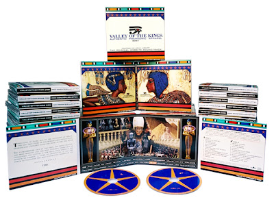
VALLEY OF THE KINGS and VALLEY OF THE QUEENS: The Original Website Soundrack and Official Poster


Dagmar Jeffrey, Creative Arche-tech, Archetype Design Studio
Album packaging: 8 fold custom double CD eco wallet
Client: KMT Enterprises, LLC.

VALLEYOFTHEKINGS.COM and VALLEYOFTHEQUEENS.COM are the official dedicated online stores of authentic pharaonic apparel. These modern, designer clothing lines are inspired by the art, culture, iconography and spirit of Ancient Egypt, the world's first nation-state.

Influenced by Classical European, African, Middle-Eastern, and Contemporary musical sources, Brain Lashure brilliantly captures the mystery, power and unparalleled majestic splendor of Ancient Egypt in this double CD set.

Design: Dagmar Jeffrey
Poster: 3'x2' waterless offset on 12pt semi-gloss aqueous coated stock

The Architect of this fashion line strives to maintain authenticity as much as possible throughout the branding. The centerfold for example, shown in more detail here, was implemented into a poster and was composed of dozens of authentic Ancient Egyptian artifacts to tell the epic story behind the brand. Some of the images were obtained from as far away as the Cairo Museum. It compliments the CD as well as promote the web site and consequently, the line itself.

Friday, June 15, 2007

Cover design for Bryan Hughes by Carolyn Quan


Carolyn Quan, designer Dream World Media

Album Packaging Gatefold Booklet for Jazz Guitarist
Client: Brian Hughes/Sylvan House Music

Wednesday, June 13, 2007

Guppy Art - Echo and the Bunnymen


Box set design by Guppy Art: www.guppyart.com
Design by Rachel Gutek

Echo and the Bunnymen
Crystal Days:1979-1999
Warner Brothers/Rhino 2001

Monday, June 11, 2007

The Mars Volta - Jared Conner

The Mars Volta
Gig poster by Jared Conner

A standout member of Texas' newest generation of rock poster luminaries, Jared Connor creates posters with that irrepressible irreverence native to the Lone Star State. After years of late nights, last calls and paying his dues in the live-music clubs of Austin, he began producing his own posters in 2000. He founded his studio, Mexican Chocolate Design, shortly after that. With a graphic vision born in Texas and forged in the fires of the Gulf War, and a graphic vocabulary refined by his early schooling in commercial art and screen-printing, Jared refuses to make posters that are trite or trendy self-indulgent tripe with no connection to a band's music and fan base. He creates honest posters. Today he counts among his clients The Mars Volta,Turbonegro, No Warning, Honky, Warner Brothers, Universal, Roadrunner Records, Teepee Records, Gyro Worldwide, Tribal DDB, Arclight Records, Josephson Engineering and Capita Snowboards.

--Nels Jacobson

www.mexicanchocolatedesign.com

Saturday, June 9, 2007

Elliot Smith, New Moon - Design by Mike King


I came across this CD by Elliot Smith while surfing (okay...treading water) on the internet. Very cool. I did a little further research on the designer and came across Mike King's website. It's well worth your time to check out. Some wonderful poster designs as well. I hope to have an interview with Mike that I can post here on Design Recital soon. Watch for it.

Thursday, June 7, 2007

Gospel Music


Here is my personal cd project I did about a year and a half ago. I have sold nearly two thousand cd's without any real marketing. Only selling to a few churches that are connected to my home church through it's various ministries.

The artwork came about by drawing over some pictures that I had taken of myself and scanning in those scraps . Then I built the design around those pieces, painting with various brushes and using textures to add design elements to portray the feeling I was after.

Overall it was a great and fun project. From the recording of the music and seeing all of the in's and out's of how a studio works. Adding in orchestration and background singers. To the design and layout. Experimenting with textures and brushes.