Wednesday, June 27, 2007

FEIST


Ahh! - Sorry, I am way over due for a first post to this blog, so let's have it be Feist. This a 4 color screenprint that I just completed for a sold out LA show for Feist and Grizzly Bear. I wasn't going to do another rock poster this summer, but I love Feist and couldn't pass up the opportunity. I usually don't do portraits of the musical artists for gigposters, mainly because I find it difficult to draw people accurately! Feist's music is pretty personal, and so it seemed natural to have her lovely mug on there. This image was initially done in brush and ink.

John Van Hamersveld


John Van Hamersveld was born in 1941 in Baltimore, MD. He both attended and taught at Art Center College of Design in Pasadena and California Institute of the Arts. From earliest positions of art director of Surfer Magazine and Capitol Records. John's experience has spanned album cover, poster, packaging, industrial, magazine and book design.

John has designed over 300 album covers for groups like the Beatles, Rolling Stones, Blondie, Kiss, Public Image and many others, including… Exile on Main Street and Magical Mystery Tour.

His 360° mural at the Los Angeles Coliseum, executed for the 1984 Olympic Games won him national recognition by the American Institute of Architects. He is also well known for his poster design for the movie, The Endless Summer, which is one of the most popular and recognizable poster images of all time. His work as part of the concert promotion company Pinnacle resulted in one of John’s most enduring body of posters, including what is widely considered one of the greatest rock posters ever made, for Jimi Hendrix at LA’s Shrine Auditorium.

More recently, John designed the posters for the Cream 2005 Reunion Concerts at London’s Royal Albert Hall and Madison Square Gardens and the packaging for the Warner Brothers CD and DVD releases.

Monday, June 25, 2007

The Thieves of Kailua - CD project design - Brian Bosworth

When we began tossing around ideas to create an album cover for 'Thieves', Jason had already self-released the record a year or two beforehand. He was burning the discs himself and sewing these great little burlap sacks with wooden buttons to slip them in. He came to me because he's rifled through my sketchbooks for some time and thought my drawing style would work for his vision. By that point he already had a list of elements that he was drawn to (tropical sunset, mountains, jungle, beach), and a certain aesthetic -- it was important for him to retain a hand crafted, organic feel. The aesthetic I was drawing on came from many places: pin up girls, disney background paintings, 60s tiki style, japanese woodblock prints. I was also looking at jungle plants and tropical birds, and was sketching the whole time. All of the drawings on the cover and the inside flaps were done by hand, but I put everything together and messed with colors on Photoshop (with a little help from Illustrator). The burlap pattern on the sleeve came from a scan of the same material he used for his homemade version. I think I'm drawn to actually listing personal references with musicians I'm working with -- stream of conscious lists of themes, memories, objects or whatever they drew on to create the music -- and sneaking as many symbols of these as possible into the album art. It's a great way to drum up a bunch of wonderful and legitimate material to dig into and work with.

Friday, June 22, 2007

Gettin' Lucky On #13 -VANS WARPED TOUR 2007


FOR IMMEDIATE RELEASE


Artist Brian Ewing Gets Lucky with 13th Annual Warped Tour

San Francisco, CA –June 15, 2007-For the fourth year in a row, renowned rock poster artist Brian Ewing has “inked” a deal with sponsor AT&T to produce the artwork for six posters and cell phone graphic downloads for the Vans Warped Tour, “Lucky 13”.
He has designed concert posters and t-shirts for the Vans Warped Tour since 2004, consistently helping to build their brand by creating a definitive image and character for the Tour.

A popular exclusive attraction that will be back at the Warped Tour this year is the AT&T Signing Stage, where fans can meet the band members and get autographs on the official posters illustrated by Brian.

The posters will only be available at the Warped Tour. Posters from previous years have taken on a life of their own, becoming highly sought after by collectors and fans of both the artist and the featured bands. Some fans have even gone so far as to get tattoos of Brian’s distinctive artwork. Coincidently, the Tour’s 2007 visual theme of tattoo art and posters designed to resemble tattoo flash might prompt even more fans to follow suit.

Brian Ewing is a San Francisco based Rock Poster Artist who has worked in the music industry since 2000. For the past three years he has worked and toured with the Vans Warped Tour and the Taste Of Chaos tour. Brian has collaborated with such bands as Queens Of The Stone Age, Billy Idol, Taking Back Sunday, Brand New and My Chemical Romance.

For further information please visit

BRIANEWING.com


href="http://www.flickr.com/photos/34402640@N00/579571277/">BRIAN EWING.warp.tour.07.jpg
Originally uploaded by brianewingdotcom.

BRIAN EWING.warp.tour.07.jpg


Thursday, June 21, 2007

Broken String by Camp Bosworth


Broken String by Camp Bosworth - 60" x 36" oil on canvas
www.sawdustpoet.com

Wednesday, June 20, 2007

Full Sail Offers Associate of Science in Graphic Design

Full Sail Real World Education has announced the start of an Associate of Science Degree in Graphic Design beginning in July 2007.

The new Graphic Design degree will incorporate courses that range from Color Theory and Logo Design to Typography and Page Layout. In addition, the program will teach students many aspects of Corporate Branding and Client Relations, which will give graduates the ability to immediately work in a professional design firm.

"What makes this degree program unique is that a student has the opportunity to concentrate on their passion of creating design work instead of focusing solely on the technical aspect," said Bill Galbreath, Digital Arts & Design Program Director. "This gives the designer the ability to get an Associate's Degree and then continue on at Full Sail working toward a Bachelor of Science Degree in Digital Arts & Design."

For more information visit www.fullsail.com

Tuesday, June 19, 2007

Fantagraphics Bookstore & Gallery, in association with Georgetown Records, hosted an "evening of fine art and punk rock." "Filthy Beasts" combines the CD release of the DT's "Filthy Habits" recording on the Get Hip label with an exhibition and signing of Jim Blanchard's "Beasts and Priests" art book. Design by Art Chantry, illustration by Jim Blanchards.

Saturday, June 16, 2007

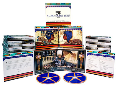
VALLEY OF THE KINGS and VALLEY OF THE QUEENS: The Original Website Soundrack and Official Poster


Dagmar Jeffrey, Creative Arche-tech, Archetype Design Studio
Album packaging: 8 fold custom double CD eco wallet
Client: KMT Enterprises, LLC.

VALLEYOFTHEKINGS.COM and VALLEYOFTHEQUEENS.COM are the official dedicated online stores of authentic pharaonic apparel. These modern, designer clothing lines are inspired by the art, culture, iconography and spirit of Ancient Egypt, the world's first nation-state.

Influenced by Classical European, African, Middle-Eastern, and Contemporary musical sources, Brain Lashure brilliantly captures the mystery, power and unparalleled majestic splendor of Ancient Egypt in this double CD set.

Design: Dagmar Jeffrey
Poster: 3'x2' waterless offset on 12pt semi-gloss aqueous coated stock

The Architect of this fashion line strives to maintain authenticity as much as possible throughout the branding. The centerfold for example, shown in more detail here, was implemented into a poster and was composed of dozens of authentic Ancient Egyptian artifacts to tell the epic story behind the brand. Some of the images were obtained from as far away as the Cairo Museum. It compliments the CD as well as promote the web site and consequently, the line itself.

Friday, June 15, 2007

Cover design for Bryan Hughes by Carolyn Quan


Carolyn Quan, designer Dream World Media

Album Packaging Gatefold Booklet for Jazz Guitarist
Client: Brian Hughes/Sylvan House Music

Wednesday, June 13, 2007

Guppy Art - Echo and the Bunnymen


Box set design by Guppy Art: www.guppyart.com
Design by Rachel Gutek

Echo and the Bunnymen
Crystal Days:1979-1999
Warner Brothers/Rhino 2001

Monday, June 11, 2007

The Mars Volta - Jared Conner

The Mars Volta
Gig poster by Jared Conner

A standout member of Texas' newest generation of rock poster luminaries, Jared Connor creates posters with that irrepressible irreverence native to the Lone Star State. After years of late nights, last calls and paying his dues in the live-music clubs of Austin, he began producing his own posters in 2000. He founded his studio, Mexican Chocolate Design, shortly after that. With a graphic vision born in Texas and forged in the fires of the Gulf War, and a graphic vocabulary refined by his early schooling in commercial art and screen-printing, Jared refuses to make posters that are trite or trendy self-indulgent tripe with no connection to a band's music and fan base. He creates honest posters. Today he counts among his clients The Mars Volta,Turbonegro, No Warning, Honky, Warner Brothers, Universal, Roadrunner Records, Teepee Records, Gyro Worldwide, Tribal DDB, Arclight Records, Josephson Engineering and Capita Snowboards.

--Nels Jacobson

www.mexicanchocolatedesign.com

Saturday, June 9, 2007

Elliot Smith, New Moon - Design by Mike King


I came across this CD by Elliot Smith while surfing (okay...treading water) on the internet. Very cool. I did a little further research on the designer and came across Mike King's website. It's well worth your time to check out. Some wonderful poster designs as well. I hope to have an interview with Mike that I can post here on Design Recital soon. Watch for it.

Thursday, June 7, 2007

Gospel Music


Here is my personal cd project I did about a year and a half ago. I have sold nearly two thousand cd's without any real marketing. Only selling to a few churches that are connected to my home church through it's various ministries.

The artwork came about by drawing over some pictures that I had taken of myself and scanning in those scraps . Then I built the design around those pieces, painting with various brushes and using textures to add design elements to portray the feeling I was after.

Overall it was a great and fun project. From the recording of the music and seeing all of the in's and out's of how a studio works. Adding in orchestration and background singers. To the design and layout. Experimenting with textures and brushes.

Wednesday, June 6, 2007

Joe Damico cd cover


Hey all,

Great idea for a blog! The Bureau has made a conscious effort to try to take on more music related projects this coming year. In fact we have been toying with the idea of launching a tiny independent label to release my side projects as well as some of our friends who are musicians.


Anyway, this is a piece I did for Joe Damico who is a great singer / songwriter. We have done numerous projects for him in the past and it's always been great projects. Joe lets us have free reign over the creative. He is one of the rare musicians who understand their craft and trust us to do our thing which is easy for us since Ty and I are big fans of Joe's music.


For this upcoming release, Joe wanted to actually put out vinyl as well as the cd. The 12x12 space of a record sleeve is the holy grail for Ty and myself, so I couldn't wait to rock something out. I pitched the idea to Joe of doing an illustration / layout that paid homage to the classic Decca era jazz covers. Originally we wanted to do something a little more Reid Miles' Blue Note era but I felt like that has been done to death.


It was important to me to really get the look and feel just right. I didn't want it to look "faked" in any way. The typography had to use the right font and have the looseness of being set by hand. In order to make sure it had an authentic feel, I hand created all the elements. The background was old paper that I had collected that I soaked with some extra roast Maxwell House coffee and then I let it dry out side, picking up dust and dirt that would blow onto it from the slight breeze. I then did a couple of pages of color wash using really watered down gouache and watercolors. Once the paper had dried I tore strips out and scanned them at a extreme high res.


For the deer, I illustrated them and inked them at first using a brush but found the line weight was a little too shaky. After a few attempts, I finally switched to using calligraphy pens nibs.


After I scanned all the images, I went through my record collection and spent time deconstructing the old layouts, making sure to get the relationship between the graphic and the typography just right and how they relate to each other and to the space of 12x12.


I really am pleased with how this all came together and is one of my favorite pieces that I have done recently.


>K.

Tuesday, June 5, 2007

Sgt. Pepper's Lonely Hearts Club Band

I thought it would be appropriate to feature the Sgt. Pepper album cover on the 40th anniversary of its release by The Beatles. The cover was art directed by Robert Fraser in collaboration with Paul McCartney. Peter Blake was the designer and the photographer was Michael Cooper.

The Beatles, Fraser and Blake chose the personalities -- dead and alive -- from philosophy, music, literature, sport, science, movies. Blake had prints blown up into life-sized cut-outs. Mae West initially refused, stating: "What would I be doing in a lonely hearts club?" Marlene Dietrich wanted to see the cover first.

From Wikipedia's entry about Robert Fraser,
Art director Robert Fraser was a prominent London art dealer who ran the Indica Gallery. He had become a close friend of McCartney's and it was only at his strong urging that the group abandoned their original cover design, a psychedelic painting by The Fool. Their design for the inner sleeve was, however, used for the first few pressings. Fraser was one of the leading champions of modern art in Britain in the 1960s and after. He argued strongly that the Fool artwork was not well-executed and that the design would soon be dated. He convinced McCartney to abandon it, and offered to art-direct the cover; it was Fraser's suggestion to use an established fine artist and he introduced the band to a client, noted British 'pop' artist Peter Blake, who, in collaboration with his wife, created the famous cover collage, known as "People We Like".

Monday, June 4, 2007

The Oregon Valley Boys Logo

I started a western swing band here in Oregon last year and asked my good friend and illustrative designer Von Glitschka to help with the design. I wanted the band to look legendary even though we had not had our first gig. :P

I did the illustration of Mt. Hood in the background, Von refined it and created the rest of the logo. I think it works great.

Welcome to Design Recital

Welcome to an artist community blog that focuses on graphic design and illustration for the music industry. I hope you enjoy your visit and come away with a new appreciation for the art of music.